Title Design

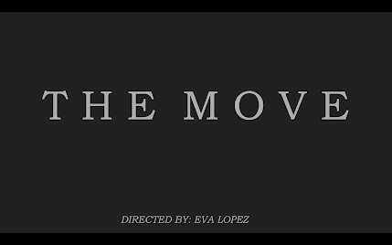
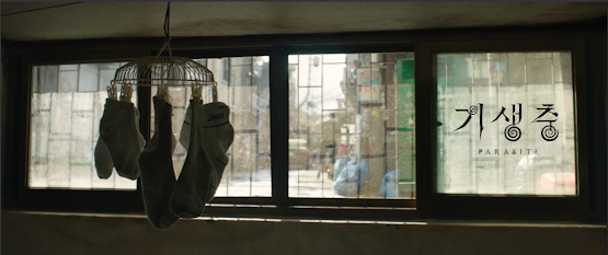
The location of my titles will vary in location depending on the color most prominent in the shot. However, the goal is to keep most of them in the bottom right corner of the screen like they do in movies! The working title at the moment is "The Move," but I really think I might end up changing this if I think of a stronger main title. As for the color, my goal is to keep the credits white. I think that the white on black is super sleek and simple, yet equally as effective as any other bold color. Plus, I think that by using white, it won't draw attention away from the shots (which would still be telling a story). The main title will have the biggest size in order to create that emphasis. As for the credits, they will be around 1/4 the size of the main title. As mentioned previously, I want to fit them in the bottom right corner. As for my fonts, I'll only use two. One for the main title, and one for the credits. The titles will fade in and fade out after about 10 ...


